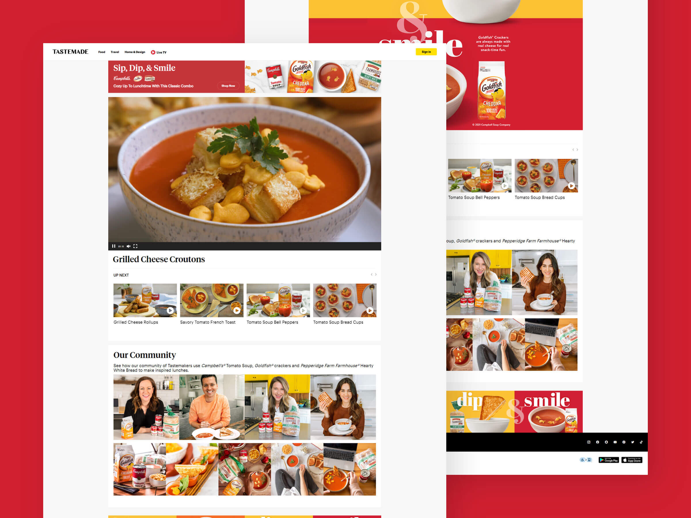
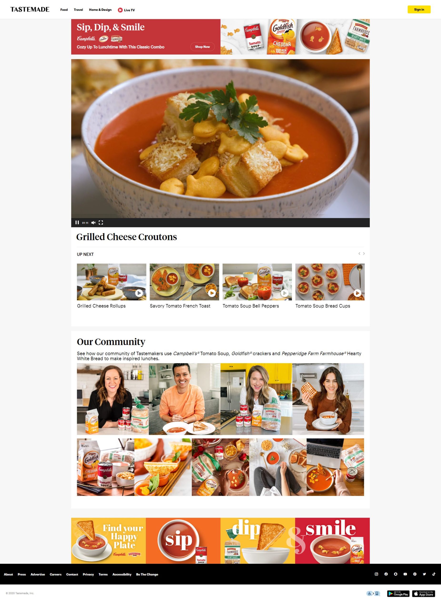
Fluid 22’s team has designed two websites for us and they have also designed several promotional materials. They are a phenomenal company to work with. They are well-organized and execute all projects in a timely manner. They are easy to communicate with and are quick to make adjustments as needed. They are awesome!
About Client
Campbell’s Soup is a well-known brand that has been a staple in households for generations. In an effort to connect with a younger audience, Campbell’s Soup created the “Sip Dip and Smile” campaign, paired with a fun and interactive website that encouraged users to share their favorite Campbell’s Soup recipes with their friends and family. The company wanted to increase brand awareness and encourage consumers to think about Campbell’s Soup as more than just a traditional can of soup.

