

Case Study
Services

OpenET is a nonprofit that provides free, satellite-based evapotranspiration (ET) data, which measures how much water crops and other plants consume, at the scale of individual fields. Developed by a consortium led by NASA, the Desert Research Institute and Environmental Defense Fund, it serves farmers, water managers, policymakers and researchers through its Data Explorer, API and FARMS tool.
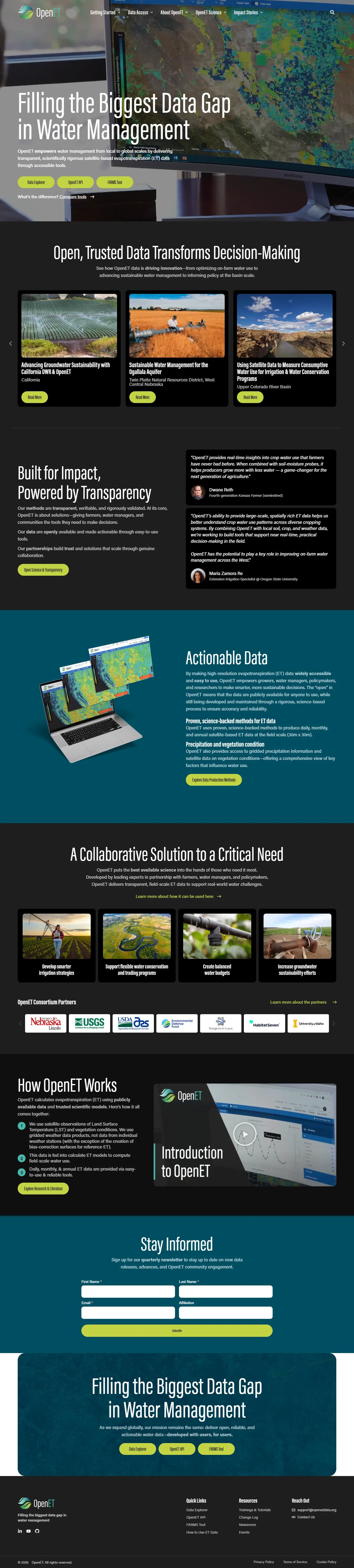
OpenET's previous website was built on a Bootstrap theme with the Divi builder. It carried a lot of valuable science, but the homepage was a block of dense text over a field photo with two buttons, and a two-row menu of a dozen links left visitors guessing where to start. As OpenET added the FARMS reporting tool alongside its Data Explorer and API, explaining which tool to use became harder.
The audience is unusually broad. A grower checking crop water use, a water district building a budget, a developer calling the API and a hydrologist reviewing accuracy all land on the same site. Each needed plain explanations of what ET is, clear access to the right tool, and the methods, accuracy data and published research that make the numbers credible.
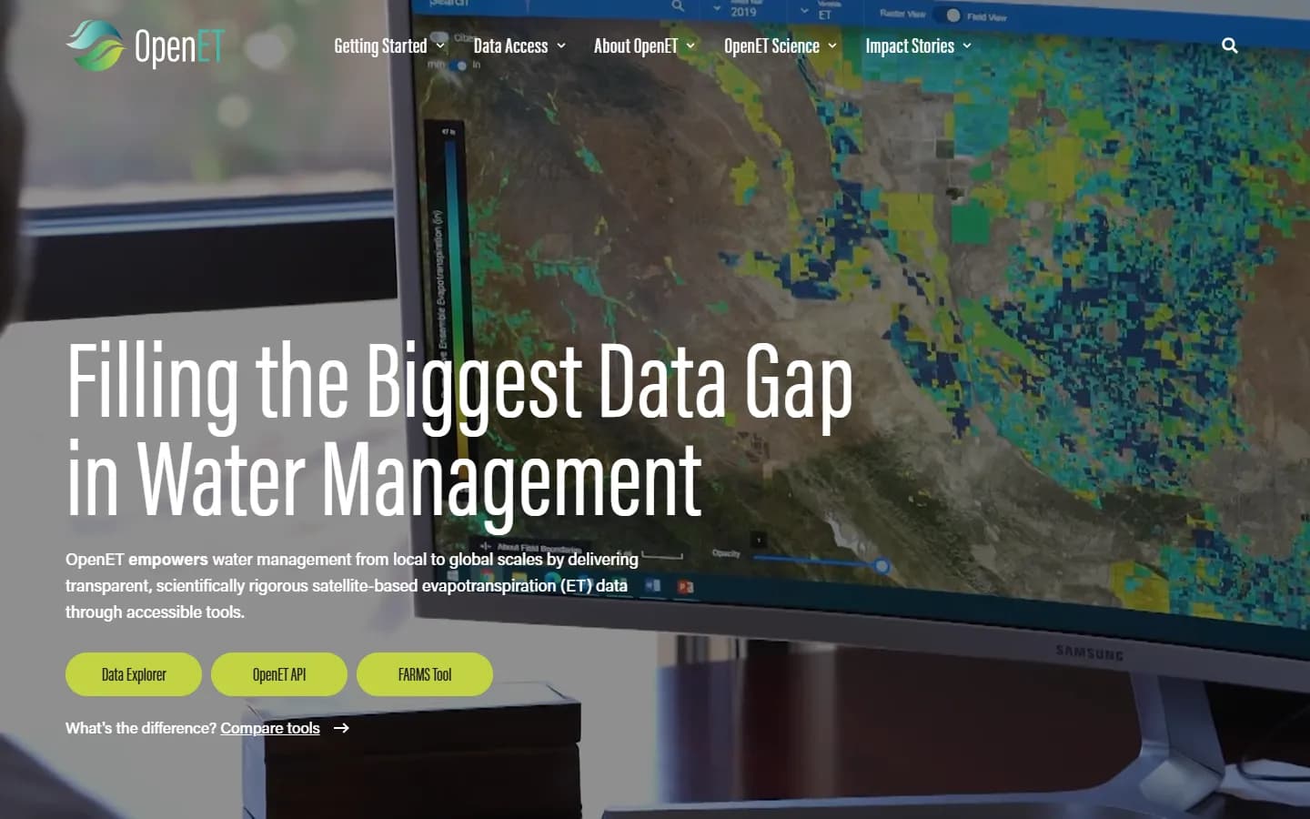
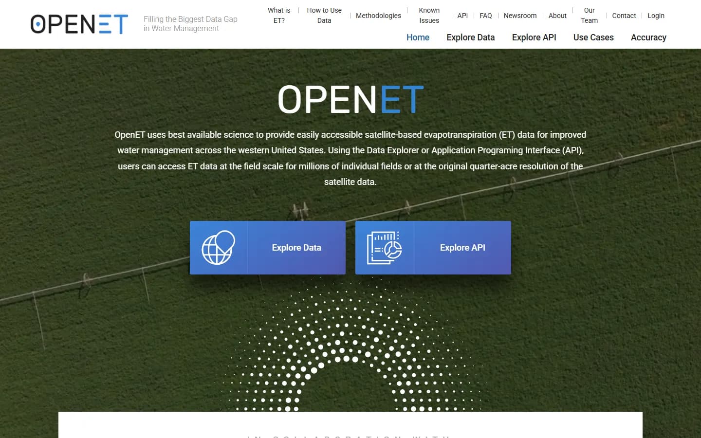
Drag to compare OpenET’s previous homepage with the site we built.
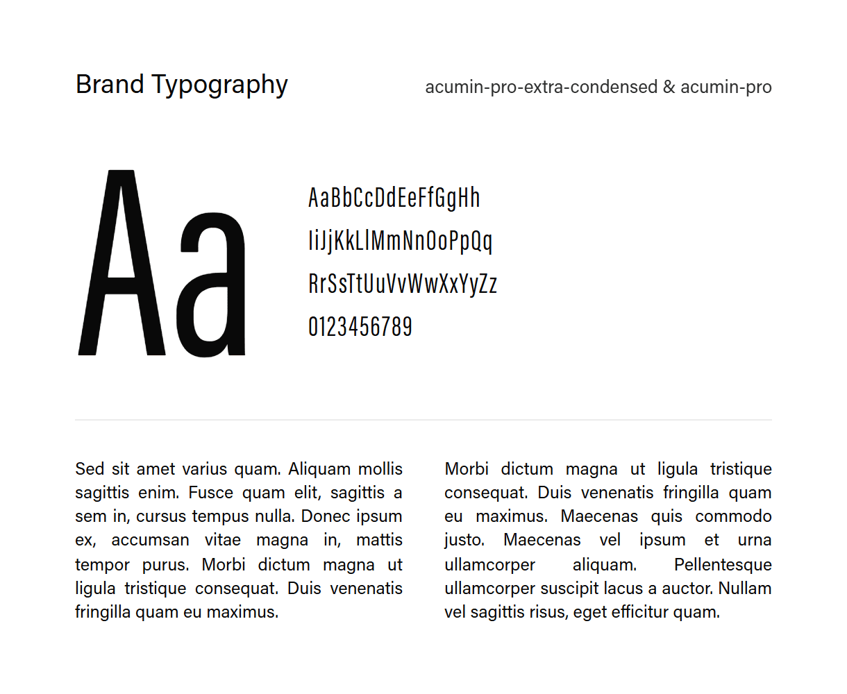
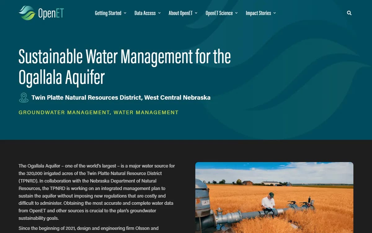
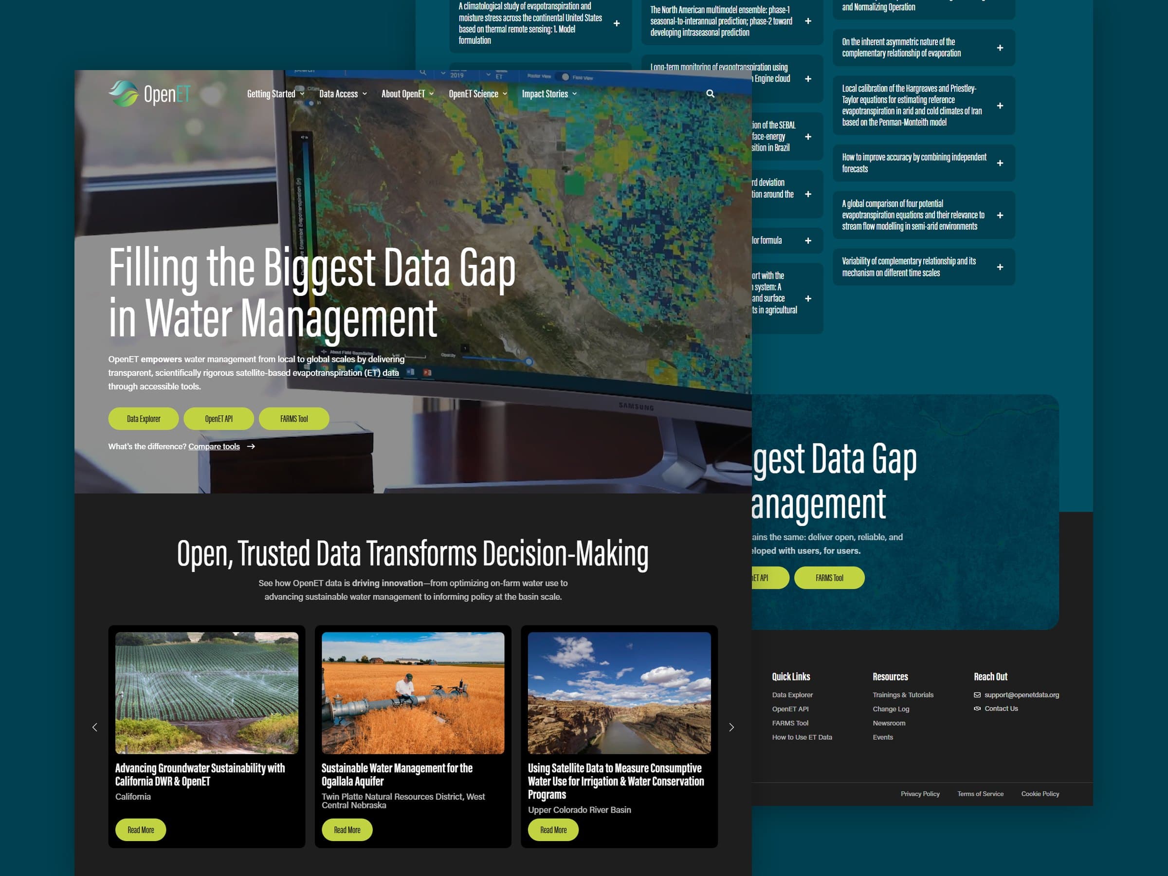
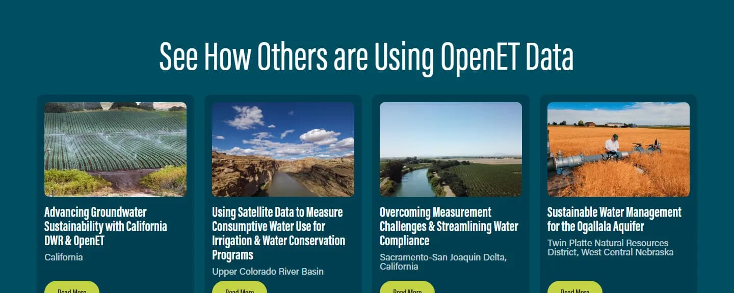
We rebuilt the information architecture around five menus: Getting Started, Data Access, About OpenET, OpenET Science and Impact Stories. The new design pairs the deep teal and lime green of the OpenET logo with tall condensed headings, dark backgrounds that let satellite maps and field photography stand out, and a full-screen video hero on the homepage that moves from satellite maps to fields and water.
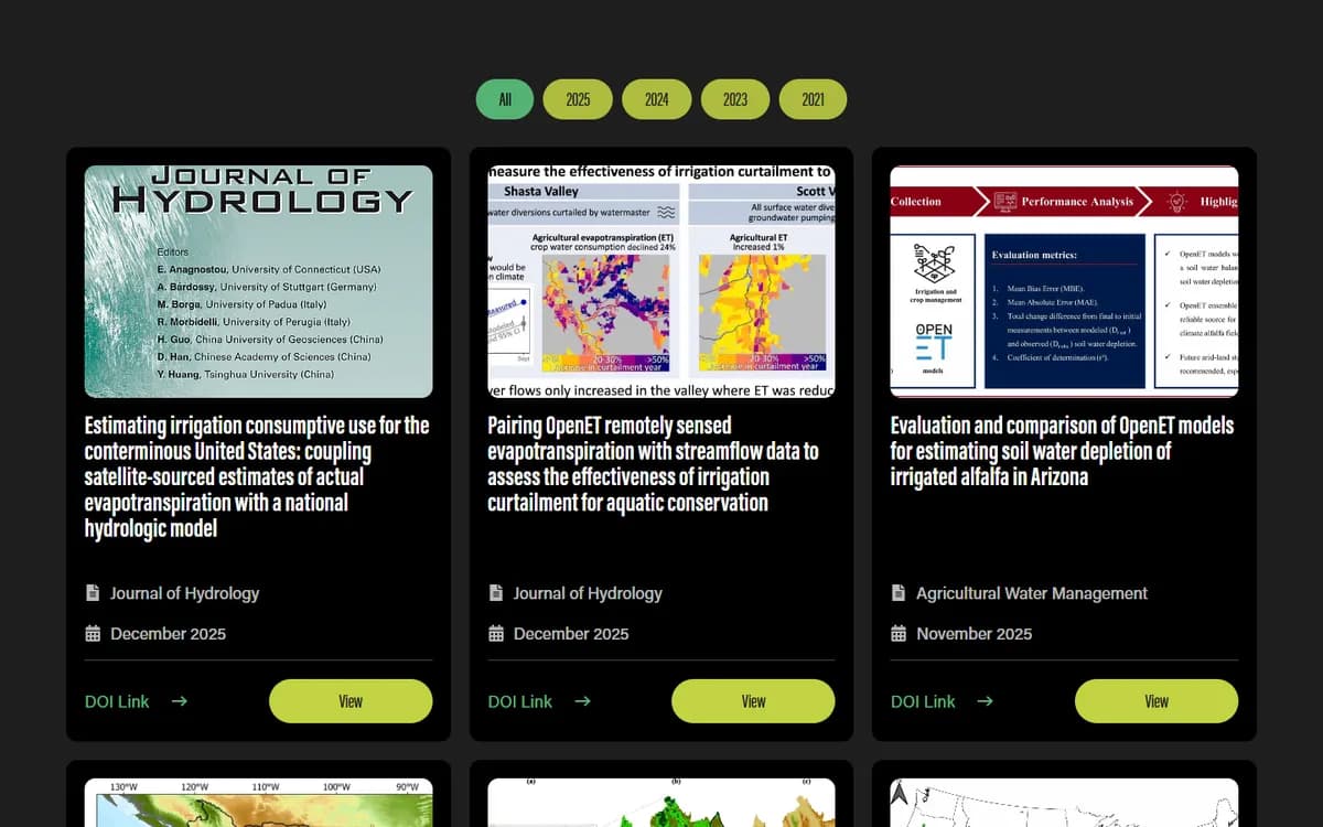
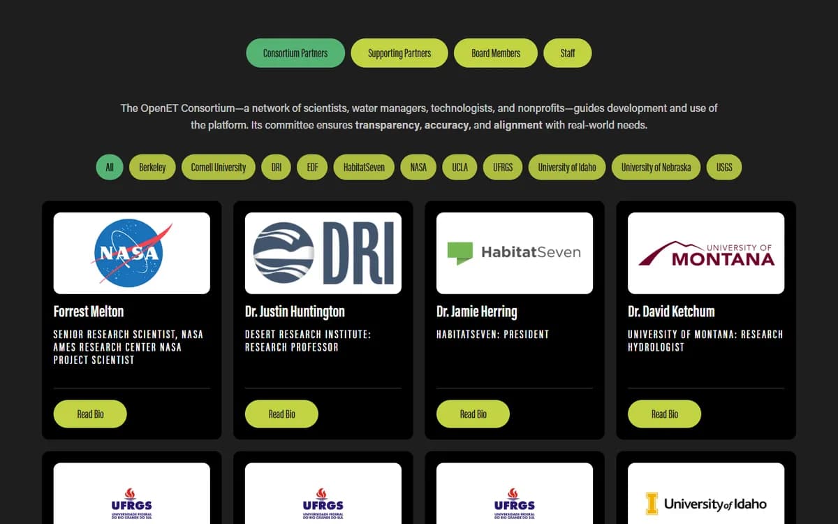
We developed the site on WordPress with Elementor Pro, using custom post types for the team, newsroom, literature and impact stories so OpenET's staff can add entries without touching page layouts. Filters sort the team by partner and research by year, a pop-up compares the three data tools, and Formidable forms handle support, media and newsletter requests.

Choose a feature to see it on the site.
The hero offers the Data Explorer, API and FARMS tool side by side, and a Compare tools link opens a pop-up explaining what each is for. Visitors can choose the right way into the data before leaving the homepage.
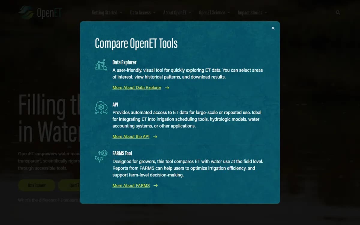
The homepage now says what OpenET does in one sentence and puts the three data tools right below it. Five well-organized menus replace a crowded two-row navigation, so new visitors know where to begin.
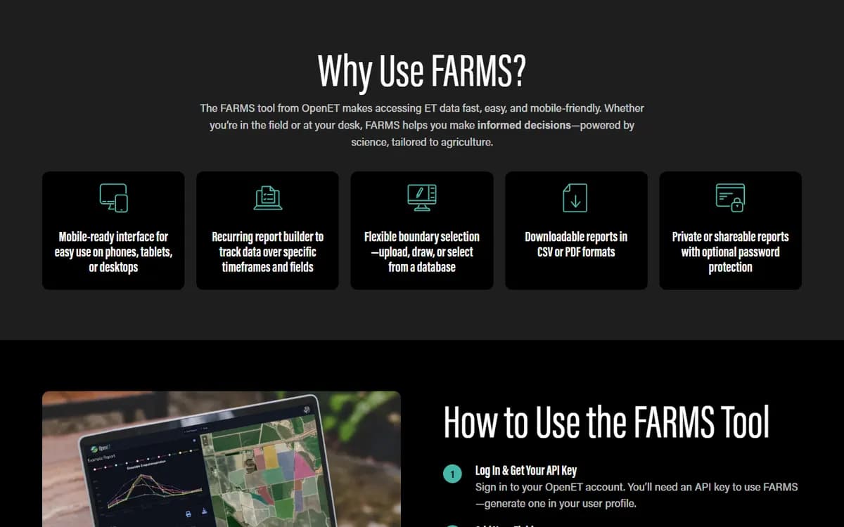
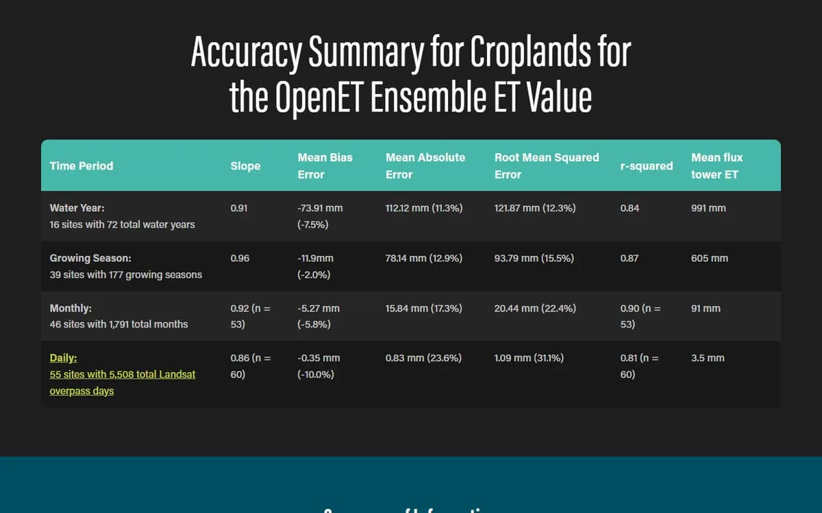
Methods, accuracy and research pages break dense material into tables, short sections and expandable panels. Experts get the detail they expect, and newcomers can start with What is ET? and work their way in.
Dark layouts, the teal and lime palette and condensed headings give satellite maps and field photography room to stand out. The site now looks as modern and credible as the data behind it.
Team members, news, papers and impact stories are managed as their own content types with filters built in. OpenET's staff can publish new research or a new story and it appears in the right place across the site.
Tell us where you want your business to go. A senior member of our team will get back to you right away.